Modern Minimalist Packaging Ideas for Custom K Cup Boxes That Speak Through Simplicity

In a market crowded with loud graphics and overly complex packaging, simplicity is becoming the strongest statement a brand can make. Minimalist design, rooted in balance, space, and natural tones, has evolved into a symbol of sophistication and trust. For coffee brands, especially those offering single-serve pods, Custom K Cup Boxes designed with minimalist elements can speak volumes without saying too much.
At Haul Packaging, brands are discovering how modern, clean packaging elevates their identity allowing the product itself to take center stage. This article explores minimalist-inspired strategies to help brands create K Cup packaging that feels fresh, pure, and effortlessly premium.
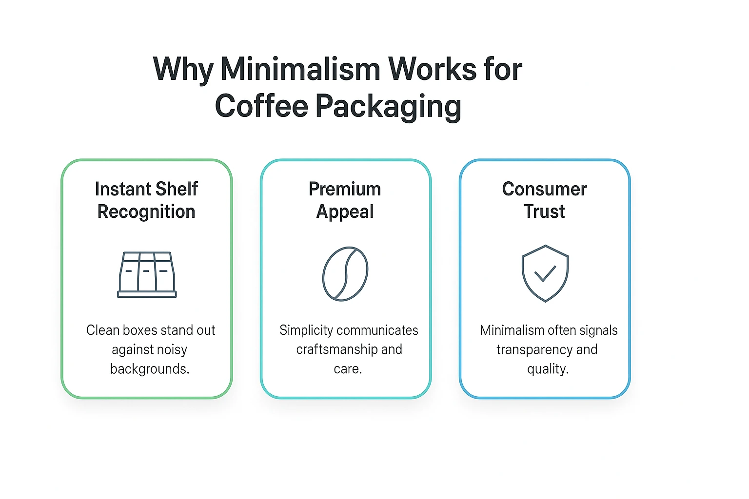
Why Minimalism Works for Coffee Packaging
Minimalist design isn’t about using less, it’s about using purposefully. Instead of vivid clutter and decorative chaos, minimalist packaging focuses on clarity, calmness, and brand integrity.
Key advantages include:
- Instant Shelf Recognition: Clean boxes stand out against noisy backgrounds.
- Premium Appeal: Simplicity communicates craftsmanship and care.
- Consumer Trust: Minimalism often signals transparency and quality.
With coffee, where flavor and ritual matter most, minimalist packaging supports rather than distracts from the experience.
- Earth-Toned Base Colors: Let the Texture Speak
Warm neutrals like kraft brown, ivory, cream, or soft gray create a grounded, authentic foundation for Custom K Cup Boxes. Natural textures convey calmness and honesty ideal for brands emphasizing purity, origin, or sustainability.
- Uncoated kraft boards offer an organic, tactile experience.
- Matte-soft backgrounds evoke elegance without effort.
- Monochrome schemes preserve focus and balance.
Sometimes the most powerful design is simply a quiet surface with space to breathe.
- Quiet Typography With Confident Placement
Minimalist box design relies heavily on typography. The fewer words used, the more powerful they become.
- Use clean sans-serif fonts for modern balance.
- Keep the brand name centered or aligned cleanly at the top.
- Avoid clutter only include essentials: roast type, blend name, cup count.
A simple composition such as “Dark Roast – 12 Single-Serve Cups” placed with precision can feel far more premium than bold banners and icons.
- Line Art, Subtle Illustrations, and Micro Details
Instead of heavy visuals, minimalist packaging leans into delicate graphics. Fine line drawings, small icons, or single-bean illustrations communicate thoughtfully without overwhelming.
Popular visual accents for K Cup packaging:
- A single coffee bean sketch
- A minimal mountain outline for origin story
- Simple sun or flame icons to express warmth or boldness
Every line must serve intention.
- The Impact of Negative Space
Empty space is not wasted space, it is breathing room for the eyes. When designing Custom K Cup Boxes, resist the urge to fill every corner.
White or craft space helps viewers focus on the brand name and message. It fosters calmness, curiosity, and quiet confidence.
Minimalism teaches that absence can be a powerful presence.
- Natural Finishes Over Saturated Shine
Minimalist packaging is defined by refined textures rather than flashy effects. Instead of heavy gloss or metallic layers, consider:
- Matte finish: Soft and velvety, invites touch.
- Raw kraft texture: Feels eco-conscious and earthy.
- Soft-touch coating: Adds luxury through tactile depth.
Subtle doesn’t mean boring, it means beautifully restrained.
- Neutral Ink Palettes With Signature Accent
Color in minimalist design is thoughtful, not decorative. Stick to neutral tones espresso brown, charcoal, deep olive, muted terracotta and allow one accent to reveal personality.
Example palette:
- Base: Kraft beige
- Text: Deep mocha
- Accent: Burnt orange (for bold roast) or Sage green (for organic blend)
Color becomes emotional guidance instead of noise.
- Storytelling in Short Form: The Brevity of Message
Minimal designs must still communicate meaning. Instead of long paragraphs, use short, poetic lines to tell your coffee’s origin or inspiration.
For custom K Cup boxes, consider adding:
“Brew Calm. Sip Slow.”
“Roasted in small batches.”
“Grounded in morning ritual.”
Minimal words. Maximum impact.
- Eco-Friendly Materials as Design Language
Minimalism pairs naturally with sustainability. Recycled kraft board, biodegradable inks, and plastic-free coatings not only appeal to modern buyers, they look aligned with clean design values.
When the packaging itself feels environmentally conscious, the box tells a story of responsibility without claiming it loudly.
- Structural Simplicity With Smart Functionality
Minimalist K Cup packaging does not mean plain rectangles. It can include practical enhancements subtly integrated:
- Slide-out trays
- Flip-top lids
- Built-in dispensers
- Inserts for pod stability
Structure should be intelligent, not decorative. Thoughtful function becomes part of quiet excellence.
- Micro Branding Elements: Logos That Whisper
Large logos dominate; small logos invite intimacy. Minimalist K Cup boxes often feature condensed logos placed modestly lower corner, top center, or aligned left.
Detail techniques enhance quality:
- Light debossing
- Foil outline only (not filled)
- Blind emboss (no ink)
Branding doesn’t shout, it settles confidently in place.
- Reducing Visual Clutter: No Overlaps, No Noise
Every element should have a purpose. Avoid pattern overload, vector crowds, or unnecessary shadows. Simplicity is not laziness, it’s refinement.
Checklist before finalizing a minimalist K Cup box:
✔ Is each panel balanced?
✔ Is text spacious and aligned?
✔ Does one glance answer: Who are you? What do you offer?
- Consistency Across All Flavors and Series
Different roast profiles or flavor ranges must feel connected. Minimalist packaging allows color-coded identification: deep green for herbal blends, black for bold roast, terracotta for spiced seasonal.
Unified structure + varied accent = organized elegance.
- Appeal to Modern Lifestyle Buyers
Minimal packaging resonates strongly with consumers who value calm aesthetics, millennials, young professionals, and intentional shoppers. Clean Custom K Cup Boxes align with organized kitchen habits, curated countertops, and “less is more” living.
A box designed for display, not storage.
- When Minimalism Meets Premium Coffee Branding
Premium coffee enthusiasts often seek ritual over routine. Minimalist packaging embodies the quiet luxury of slow brewing, even in single-serve pod form.
A modern brand experience:
- Calm visuals
- Honest materials
- Emotional presence in subtle forms
What feels quiet on the shelf becomes bold in memory.
Why Haul Packaging Is the Ideal Partner for Minimalist K Cup Boxes
At Haul Packaging, we understand the language of modern simplicity. We help brands design Custom K Cup Boxes that balance strength, sustainability, and subdued elegance. Whether you’re launching a premium roast line or refreshing an existing series, our team builds packaging that speaks calmly but confidently.
Choose minimalist design. Choose presence without noise. Choose packaging that breathes.
Conclusion
Minimalism doesn’t remove depth; it reveals it. In the world of coffee packaging, simplicity becomes a statement of quality, clarity, and care. Thoughtfully designed Custom K Cup Boxes hold more than pods; they hold a philosophy.
When your packaging reflects restraint, your product gains resonance. And through quiet choices, your brand can create the loudest impression of all trust.

